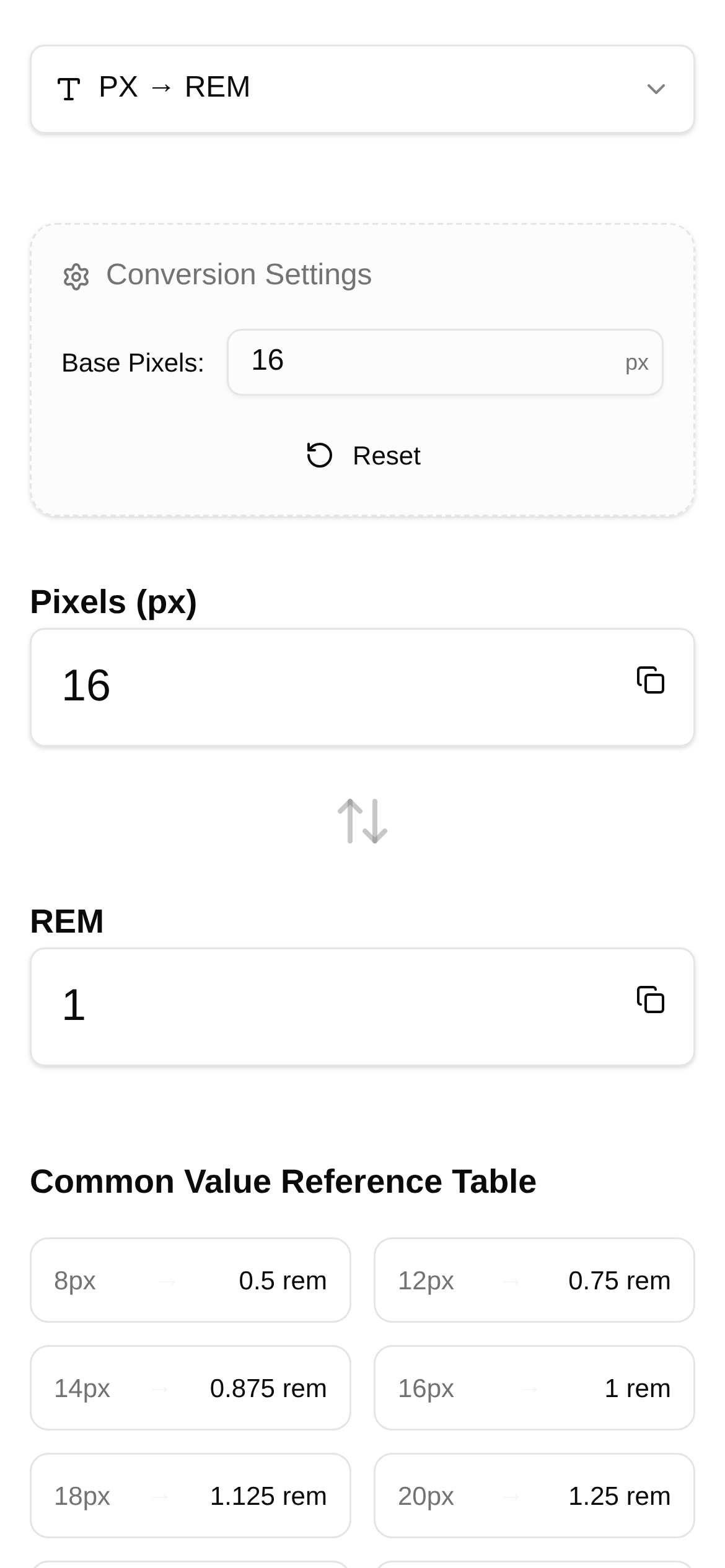
Tool Interface Preview
PX to REM Converter
Mobile devices are everywhere nowadays, making responsive layouts a standard in front-end development. However, quickly and accurately converting designer-provided pixel (PX) dimensions into relative REM units often leaves developers scratching their heads. Manual calculations are not only inefficient but also highly prone to errors. Today, let's talk about how to use a handy tool to handle PX to REM conversions in under ten minutes, making perfect responsive layouts a breeze!
Say Goodbye to Manual Math: Why Convert PX to REM?
Traditional PX units are fixed pixels, meaning they can look drastically different across devices—ranging from slightly misaligned layouts to completely ruined user experiences. REM (root em), on the other hand, is different. It's a relative unit based on the root element's (html) font size. By simply adjusting the root font size, all elements on the page scale proportionally, effortlessly achieving a responsive layout. For example, if the screen gets smaller, we just reduce the root font size slightly, and all elements using REM will shrink accordingly, perfectly adapting to any screen.
The Roadblocks of Responsive Design: Challenges of PX to REM Conversion
For front-end developers, converting massive amounts of PX values from design drafts into REM comes with a few tough challenges:
- Cumbersome calculations: Dividing every single PX value by the root font size is a massive headache.
- Precision issues: Manual calculations often result in long decimals, which can skew your layout.
- Painful updates: If the root font size needs to change, every REM value has to be recalculated—a total nightmare.
- Terrible efficiency: This repetitive work eats up way too much valuable development time.
Facing these pain points, the answer is obvious: we urgently need a fast and accurate PX to REM conversion tool.
The Ultimate Tool: Unveiling the Features of the PX to REM Converter
To solve the pain points mentioned above, we highly recommend a PX to REM Converter built specifically for front-end developers and designers. This tool is exceptional—not only does it rapidly convert PX to REM, but it also handles reverse REM to PX conversions and supports custom root font sizes. It's basically an efficiency cheat code!
Tool Name: PX to REM Converter
Direct Link: https://www.toolkk.com/tools/px-rem-converter
Tool Overview: A bidirectional pixel and REM unit conversion tool designed for front-end developers and designers. Its biggest highlight is the support for custom root font sizes.
What makes this tool so powerful?
- Bidirectional conversion at your fingertips: It doesn't just convert PX to REM; REM to PX is also a breeze, meeting your needs in any scenario.
- Custom root font sizes: You can set the
font-sizeof thehtmlelement to whatever your project requires, like16pxor100px. The tool will calculate based on your specific baseline. - Batch conversion saves time and effort: Supports entering multiple PX values at once for batch conversion, so you never have to calculate them one by one again.
- Real-time results, zero waiting: The moment you type a value, the converted result appears instantly, saving you the hassle of clicking "Submit."
- Simple operation, beginner-friendly: The interface is incredibly clean and intuitive. Even if you're a beginner, you'll get the hang of it immediately.
Practical Applications: Who Needs a PX to REM Converter?
It's safe to say this tool is perfect for almost any scenario involving front-end development and design:
- Front-end Developers: Quickly convert PX values from design drafts into REM while writing CSS to nail responsive layouts in minutes.
- UI/UX Designers: Verify how REM layouts will look during the design process, or convert existing REM values back to PX for annotations.
- Teaching and Learning: An intuitive and handy visual aid for learning the principles of PX and REM conversion.
- Code Reviews: Quickly check if the REM values in CSS code are accurate.
Whether you're wondering "how to use a PX to REM converter" or looking for a "PX to REM conversion tutorial," this tool easily meets your needs.
Step-by-Step Guide: How to Use the PX to REM Converter
Next, let's look at a practical example of how to use the PX to REM Converter to easily convert PX dimensions from a design draft into REM:
- Open the tool: Enter https://www.toolkk.com/tools/px-rem-converter in your browser and hit Enter.
- Set the root font size: Find the "Root Font Size (px)" input box and enter the
font-sizevalue of thehtmlelement in your project. For example, if your project useshtml { font-size: 16px; }, enter16. If you prefer the easier math of 1rem=100px, you can set it to100. - Enter PX values: In the "PX Value" input box, type in the PX dimensions from your design draft. You can enter a single number or separate multiple numbers using spaces, commas, or line breaks.
- View the results: You'll see the converted REM values appear in real-time in the "REM Value" input box. If you entered multiple PX values, it will display all the corresponding REM values.
- Reverse conversion (if needed): If you want to convert REM to PX, simply enter the REM value in the "REM Value" input box, and the tool will automatically display the corresponding PX value in the "PX Value" box.
A quick tip: To build better responsive layouts, we typically use Media Queries in CSS to dynamically adjust the font-size of the html element, like this:
html { font-size: 16px; /* Default base size */ }
@media screen and (max-width: 768px) {
  html { font-size: 14px; /* Slightly smaller on small screens */ }
}
@media screen and (max-width: 480px) {
  html { font-size: 12px; /* Even smaller on mobile screens */ }
}
Frequently Asked Questions and Tips:
Q1: There are so many PX to REM tools out there. What makes this one special?
A1: The biggest advantage of the PX to REM Converter is its clean, intuitive interface, bidirectional conversion, and highly flexible custom root font sizing. Compared to tools that require plugins or complex setups, it's lightweight, user-friendly, and perfectly meets your core need for rapid conversion. It's ideal for developers who prioritize efficiency.
Q2: What is the best root font size to use?
A2: Generally, there are two common approaches:
- Using
16pxas the baseline: The default browser font size is usually16px. Using it directly as the root font saves some extra configuration. However, the resulting REM values might have long decimals. - Using
100pxas the baseline: Setting thehtmlfont-sizeto100pxmeans1remequals exactly100px, making calculations incredibly intuitive. For example,32pxin a design draft converts straight to0.32rem.
Which approach you choose depends entirely on your project's guidelines and personal preference. Whichever you pick, the PX to REM Converter supports it flawlessly.
Q3: Is this PX to REM converter suitable for mobile development?
A3: Absolutely! Mobile responsive design is exactly where REM units shine the brightest. With this tool, you can quickly convert mobile design dimensions into REM. Pair that with media queries, and you'll achieve perfect cross-device scaling.
Q4: Is there anything I should watch out for when converting PX to REM?
A4:
- Don't use REM for everything: For things like borders (
border), it's usually better to stick with PX because they require fixed pixels. If you use REM, borders might become invisible or blurry on small screens. - Pay attention to font sizes: Converting fonts to REM is critical because it directly impacts readability and user experience.
- Keep your baseline consistent: Ensure your entire project uses the same root font size value to avoid a chaotic layout.
- Always test: After converting, make sure to test your layout across various devices and screen sizes to ensure it behaves as expected.
After reading this article and trying out the PX to REM Converter for yourself, you'll have mastered the secret to quickly converting design draft PX dimensions into REM. Say goodbye to tedious manual math and embrace highly efficient, perfect responsive layouts!
A quick disclaimer: The tools and tutorials introduced in this article are provided for reference purposes. They cannot replace professional development experience or industry-recognized best practices. Always adjust and test according to the specific needs of your actual projects.