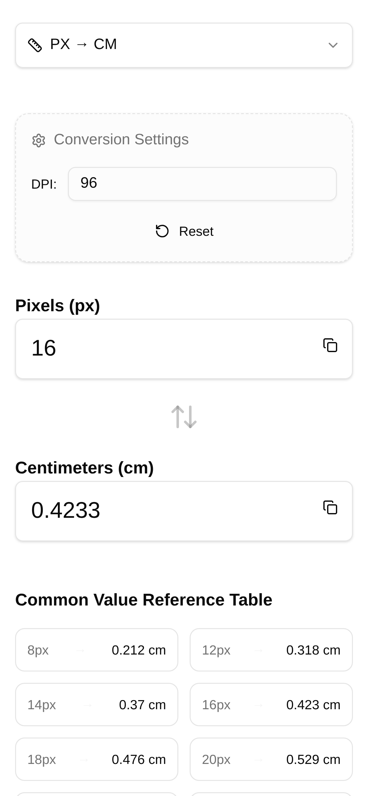
Tool Interface Preview
Pixel to Centimeter Converter
Lee, a designer, recently took on a massive project: designing a stunning brochure for a client while simultaneously creating a responsive website UI. Staring at the design draft on his monitor, he suddenly felt stuck: "How large will this 800px-wide image actually be when printed? And how will it look on mobile screens with different PPIs?"
Lee isn't alone in this. Many designers, front-end developers, and even print professionals frequently get tripped up by this exact issue. Simply put, it's the challenge of translating on-screen pixel values into real-world physical dimensions—centimeters—especially when dealing with varying devices or strict print resolution requirements.
Stop Guessing: Achieve Precise Conversions
In the past, converting pixels to centimeters usually meant relying on rough estimates or dividing by a fixed number. However, when dealing with high-resolution printing or adapting designs for various screens, these methods are highly prone to error.
Today, I want to share a tool I find incredibly handy: the Pixel to Centimeter Converter. It is designed specifically to solve these pain points. Its biggest strength is its ability to take your PPI (Pixels Per Inch) parameter and accurately convert pixel length into physical centimeter dimensions, truly achieving a "what you see is what you get" workflow.
The core advantage of this tool is that it factors PPI into the equation. As we all know, the same pixel value will result in drastically different physical sizes across devices with different PPIs.
For example, a 100px image might look quite large on a standard 72 PPI monitor, but on a 300 PPI print, it will appear much smaller—though significantly sharper in detail. This tool leverages this key principle, allowing you to input a specific PPI value to get the most accurate conversion possible.
For professionals working in UI design, print layout, and screen adaptation, this is an absolute game-changer.
Practical Applications: Seamlessly Bridge Print and Screen
-
Print Layout: Take Lee's brochure design as an example. He needs to accurately convert the pixel dimensions from his computer into the centimeter dimensions required by the print shop. If he designs a 2400px wide background image and the print requirement is 300 PPI, how wide will the image be on paper? By simply entering 2400px and 300 PPI into the tool, the centimeter value is generated instantly. This eliminates the hassle of back-and-forth revisions and ensures the final printed product matches the design draft perfectly. For graphic designers, this is an essential technique for boosting efficiency and reducing errors.
-
UI Design & Screen Adaptation: When designing responsive websites or app interfaces, designers must account for the PPI differences across various devices (like smartphones, tablets, and desktop monitors). For instance, a button designed at 96px will have a completely different physical size on an iPhone 13 Pro (approx. 460 PPI) compared to an older desktop monitor (approx. 96 PPI). With this tool, UI designers can proactively estimate the true physical size of elements across different screens, optimizing the user experience and ensuring visual proportions feel natural and comfortable. For front-end developers, this also helps in better understanding the design intent during implementation, avoiding the dreaded "it doesn't look like the mockup" scenario.
-
Image Processing & Slicing: Photographers and retouchers working with high-resolution images often need to crop photos to specific physical dimensions for printing or display. For example, if a photo needs to be printed at A4 size (21cm x 29.7cm) at 300 PPI, how many pixels are required? By using this tool to calculate in reverse, you can easily determine the necessary pixel dimensions to guide your cropping, preventing the image from becoming blurry when scaled up.
How to Use: Three Quick Steps
The tool's interface is highly intuitive. Even if it's your first time using it, you'll get the hang of it immediately.
-
Open the Tool: Simply enter the URL https://www.toolkk.com/tools/px-cm-converter in your browser to access the "Pixel to Centimeter Converter" page.
-
Enter Parameters: You'll see a few input fields on the page. First, enter the "Pixel" (px) value you want to convert. Next, enter the target device's PPI value in the "PPI" (Pixels Per Inch) field. If you aren't sure about the PPI, you can look up the device model specs; for print materials, this is generally set to 300 PPI.
-
View Results: Click the "Calculate" button, and the tool will instantly display the corresponding "Centimeter" (cm) value below. The whole process takes just seconds.
FAQ: Usage, Audience, and Best Practices
- How do I use the Pixel to Centimeter Converter? Just follow the three steps above. The key is understanding the importance of PPI: the higher the PPI, the smaller the physical size for the same pixel value.
- Who is this tool for? It's ideal for any professional who needs to convert dimensions across different mediums (from screen to print, or between different screens). This includes graphic designers, UI designers, front-end engineers, photographers, print professionals, educators, and more.
- What are the advantages over traditional conversion methods? Traditional methods often ignore PPI, leading to inaccurate data. Our tool factors in the PPI parameter to deliver high-precision conversions, solving the primary pain point of older methods.
- What should I keep in mind when using this tool? The most important thing is ensuring your PPI input is accurate. If the PPI is wrong, the conversion result will be wrong. For print, 300 PPI is the standard recommendation; for screens, you should look up the actual PPI based on the specific device model.
With this Pixel to Centimeter Converter, Lee's workflow has become much smoother. Not only can he precisely control the dimensions of his print materials, but he also has a better grasp of how UI elements will render across different devices. Say goodbye to guesswork, embrace precision, and take your design and development work to the next level!