Tool Interface Preview
PX to PT Converter
As a designer or developer, do you ever feel like PX (pixels) and PT (points) are two stumbling blocks that leave you scratching your head every time you encounter them? When exactly should you use pixels, and when should you choose points? Don't worry. Today, we're going to dive deep into everything about PX and PT, and share a handy little tool to make your design workflow smoother and more precise.
PX vs. PT: Concepts and Use Cases Explained
What Exactly is PX (Pixel)?
PX, or Pixel, simply put, is the smallest dot on a screen. It is a tangible unit that represents a physical point on your display. The websites, apps, or any other digital interfaces you design are ultimately viewed by users as images pieced together by these dense pixels. Therefore, in digital design, PX is the most commonly used and intuitive unit. Its main advantage is that it accurately maps to screen displays. However, it has a downside: because different devices have varying screen resolutions and DPI (dots per inch), the same PX value might look different in size across different devices.
Where is it commonly used?
- Web Design: Basically, all elements on a webpage, such as images, borders, and font sizes, are typically defined in PX. Although responsive design helps nowadays, PX remains the safest choice in many scenarios.
- Mobile App UI Design: Android and iOS developers know that designs eventually convert to their respective density-independent pixels (dp/pt). But during the design phase, you'll mostly draw using PX based on a specific baseline resolution.
- Bitmap Image Processing: Image dimensions, resolutions, and similar metrics are all calculated using PX.
What Exactly is PT (Point)?
PT, or Point, is an actual unit of physical length with a long history in the printing industry. One point equals 1/72 of an inch. Unlike PX, PT is an absolute unit, meaning its physical size is fixed. In digital design, PT is mostly used for typography, especially in desktop publishing and print output, because it better ensures that the physical size of fonts remains consistent across different devices.
Where is it commonly used?
- Print Design: For printed materials like magazines, newspapers, and books, font sizes and line spacing are usually specified in PT. This ensures the printed text is exactly the size you intended.
- Desktop Publishing Software: Layout software like Adobe InDesign and Microsoft Word use PT as the default unit for font sizes.
- iOS Development: In iOS development, PT is a somewhat special logical unit, also referred to as a "point." A single PT might contain several PX, depending on the device's screen density (e.g., whether it's a Retina display). This allows designers to use a unified PT unit when designing for iOS devices with varying resolutions. The system automatically converts PT to PX, ensuring consistent visual effects. This is why many designers set their design canvas to @2x or @3x and use PT for annotations when designing iOS apps.
Headaches from Converting Between PX and PT? Here's the Solution!
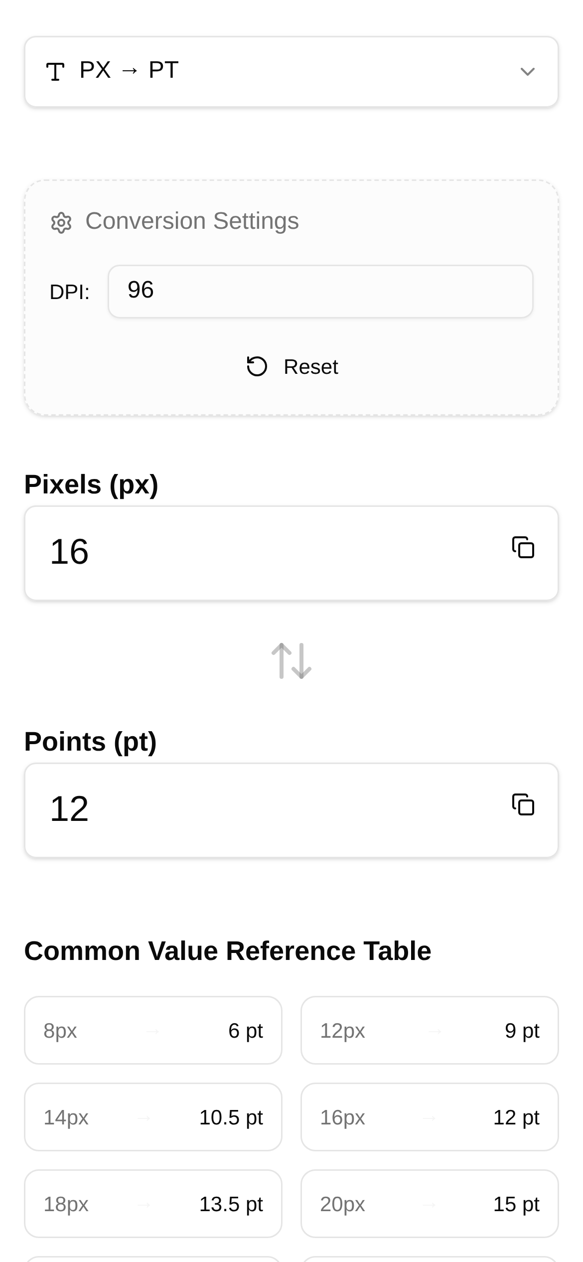
Now that we understand PX and PT, we often find ourselves bouncing between the two in actual workflow. For instance, a designer hands you a design in PX, and a front-end developer (especially for iOS) might need to convert it to PT, or vice versa. Calculating this manually is not only time-consuming but also prone to errors, especially when dealing with custom PPI (Pixels Per Inch). PPI acts as a bridge connecting digital screens to physical dimensions. It determines how many pixels can fit into a specific physical space, directly impacting the conversion ratio between PX and PT.
Therefore, having a reliable PX to PT Converter can be a massive help and save you a lot of frustration.
Tool Recommendation: PX to PT Converter
I want to highly recommend a super practical online tool: the PX to PT Converter.
What does it do?
This tool is built specifically for designers and developers to help you quickly and accurately convert between pixels (PX) and points (PT). Its best feature is the support for custom PPI, meaning you can flexibly adjust the PPI value based on different devices or design requirements for highly precise results. Whether you're working on